I am continuing to work on the ideas from my mindfulness sketchbook pages. I am still working on the boundaries in the landscape subject and the sketchbook pages are an extension of that.
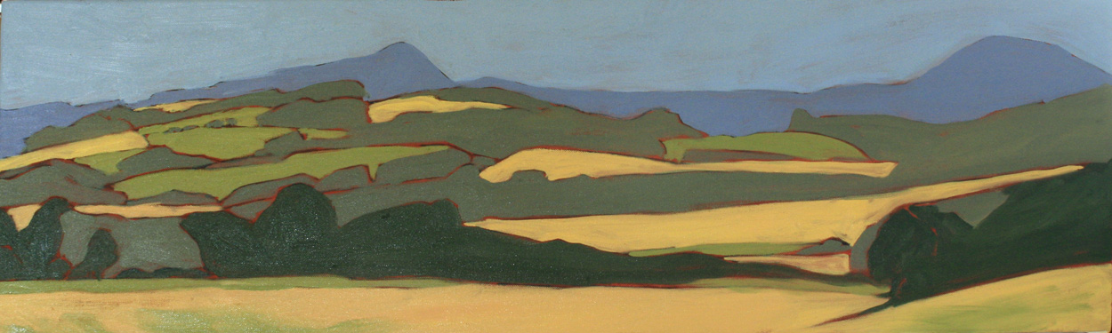
I am specifically looking at the shapes that fields form, I love how no matter how hard the farmer tries, they are never square due to things like hillocks, burns, buildings, pylons, rocks, uneven ground. The shapes of the fields are endlessly fascinating to me.
So drawing those shapes and expanding on them became a great exercise in meditation and the results are now creeping into my everyday work.
It is harder to go bigger, so I am doing it gradually, from 6 or 7 inch square in my previous post to one that is 10inches square and one that is 16inches square. I am challenging myself with the square format to see how the shapes work. I don't want them plonked in the middle, so I am experimenting with the placement of them as well. I also want to do some long thin formats too.
More ideas than time, as usual!
The first one is more or less finished, it is 10"x10" and very precise. I worked in a very strict, planned manner, drawing things out before transferring them to the canvas and keeping the paint as even as I could.
The second one, is still in progress, sorry for the slightly fuzzy photo, even though we have daylight until the wee hours here in Scotland, we do have cloud and that has reduced the light quality.

Here I have worked in a much more intuitive way, applying paint, oil pastel and charcoal and letting the shapes form themselves. I am also applying the paint in a more textured manner. Although much harder to work this way, I do find it more satisfying and more painterly.
I still have a way to go with this, but I like how it is progressing.